- A marketing dashboard is one screen showing what marketing spent, the sales it produced and the gross profit it returned, refreshed without anyone rebuilding it.
- With several brands, sites or ad accounts, layer it: a group view on top, then brand, location and channel views, all on the same definitions.
- Judge every channel on cost per sale and gross profit per £1 of media, with sales taken from your own CRM or sales system rather than the ad platforms.
- Add a tracking check comparing what each platform reports with what your CRM records, so budget never moves on a measurement fault.
- Keep Excel while one person can maintain it; move to a live view once exports, agencies and ad accounts multiply.
A marketing dashboard is one screen that shows what your marketing spent, what it produced in sales and what it returned in gross profit, refreshed without anyone rebuilding it. For a business with several brands, sites or ad accounts, the useful version is layered: a group view on top, then brand, location and channel views beneath, all built on the same definitions so every figure agrees with the one beside it. Below are seven example views, what each one shows and the decision it supports.
What a marketing dashboard is for
A dashboard earns its place when someone changes a budget, a campaign or a priority because of it. If nobody acts on a panel for a month, it is decoration. Many marketing dashboards fail that test because they repeat what the ad platforms show by default: impressions, click-through rates and platform-counted conversions are inputs, not results.
The gap is common. In Marketing Week's Language of Effectiveness survey of more than 1,000 brand-side marketers, 60% said they do not measure whether their work delivers business outcomes; the most-used metrics were conversion rates, ROI and click-through rates (Marketing Week, 2025). Only 51% of UK marketers say they have complete access to sales data (Salesforce State of Marketing 2026, 250 UK marketers). A marketing dashboard that cannot see sales can only report activity.
It is also not the same as a monthly report or a full business intelligence dashboard. The report explains what happened and what comes next (see marketing reporting across agencies, brands and ad accounts). The BI dashboard joins finance, CRM and operations for the whole business (see business intelligence dashboards and a single source of truth). The marketing dashboard sits between them: the weekly screen for deciding where the next pound goes.
What a good marketing dashboard includes
Every view below draws on the same short list of measures. Agree the definitions once, write them down, and use them for every brand, site and agency.
| Measure | Where it comes from | Why it is on the dashboard |
|---|---|---|
| Media spend | Each ad platform, checked against invoices | The cost side, split by brand, location and channel |
| Enquiries or leads | CRM or form system | Shows whether demand is arriving before sales catch up |
| Sales or bookings | Sales, booking or ecommerce system | The result, counted once rather than once per platform |
| Revenue and gross profit | Sales system, with margins from finance | What each sale was worth after the cost of sales |
| Cost per sale | Spend divided by sales | Comparable across brands, sites and channels |
| Gross profit per £1 of media | Gross profit divided by media spend | The headline test: below £1.00, a channel loses money before overheads |
| Enquiry to sale rate | CRM | Separates a marketing problem from a follow-up problem |
| Tracking match | Platform conversions against CRM sales | Shows when a platform over-claims or has stopped seeing sales |
ROAS can sit beside these, but on its own it ignores margin; why gross profit is a better test than ROAS explains the difference.
Seven marketing dashboard examples, view by view
The examples use one made-up business so the numbers connect. Say a retailer runs three brands (A, B and C) across nine shops and online, spends about £38,000 a month on Google, Meta, Microsoft Ads and a ChatGPT ads test across five ad accounts, and uses two agencies. Every figure below is illustrative.
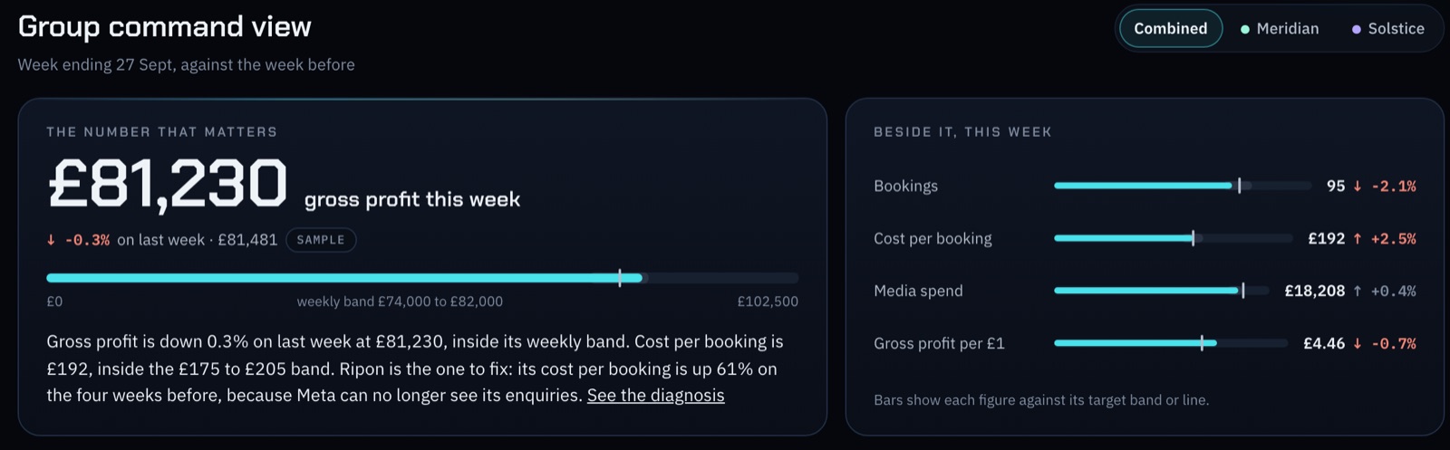
1. Group view: the CMO dashboard
Panels: six headline tiles (spend, enquiries, sales, revenue, gross profit, cost per sale) for the last 12 weeks against the 12 before; a line of gross profit by week; and a bar for each brand's gross profit with a status flag.
Figures: £263,100 of gross profit over 12 weeks: Brand A £118,000, Brand B £97,000, Brand C £48,100. The flag compares cost per sale in the last four weeks with the four before: On track if it is less than 10% higher, Watch from 10%, Act above 25%. Brand C shows Act.
Decision: where to look first on Monday morning. This is the screen for the MD and the board, so it should fit on one page and need no explanation.
2. Brand view: is each brand pulling its weight?
Panels: a funnel for one brand (enquiries, sales, conversion rate, revenue, average order value, gross profit and margin), cost per sale by week, and the brand's channel mix.
Figures: Brand B makes more sales than Brand A (1,386 against 1,124) but earns less gross profit per sale (£70 against £105), because its products carry a lower margin.
Decision: whether each brand's budget is set on volume or on profit. Multi-brand marketing can go wrong when the busiest brand simply gets the most money; this view shows which brand turns a pound into the most gross profit.
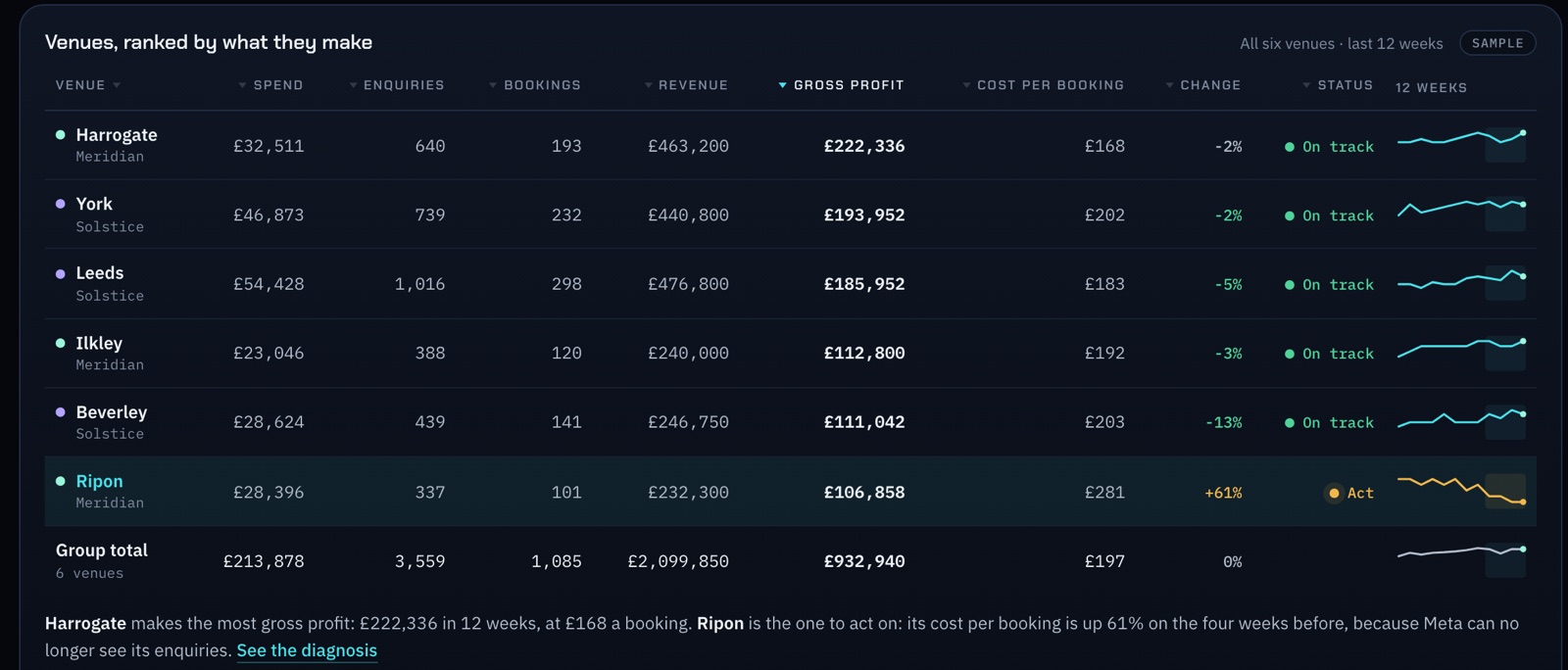
3. Location view: the league table
Panels: one row per site with spend, enquiries, sales, revenue, gross profit, cost per sale, change on the previous four weeks and a status, sortable by any column, with a one-line read under the table.
Figures: Brand C's Bristol shop sits at the bottom, with cost per sale up 31% on the prior four weeks while sales fell 12%.
Decision: which site needs attention, and whether the cause is local (stock, staffing, a landing page) or shared (a channel, a tracking fault).
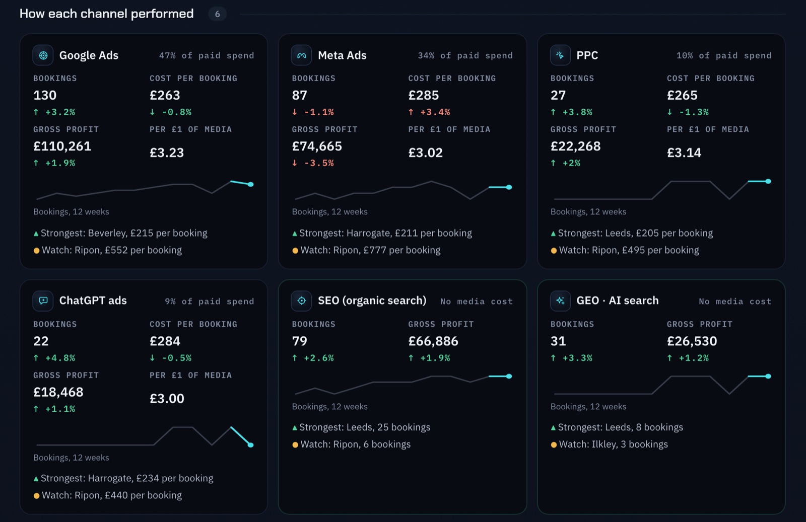
4. Channel view: the marketing performance dashboard
Panels: every channel, paid and organic, on the same measures. Illustrative figures for the last 12 weeks:
| Channel | Media spend | Sales | Cost per sale | Gross profit | Gross profit per £1 |
|---|---|---|---|---|---|
| Google Search | £54,000 | 1,350 | £40 | £121,500 | £2.25 |
| Meta | £42,000 | 840 | £50 | £71,400 | £1.70 |
| Microsoft Ads | £6,000 | 150 | £40 | £12,600 | £2.10 |
| ChatGPT ads (test) | £3,000 | 30 | £100 | £2,700 | £0.90 |
| SEO and GEO | None | 610 | Organic | £54,900 | Organic |
Decision: where the next pound goes. Google Search returns the most per pound. ChatGPT ads return less gross profit than they cost, which is acceptable for a capped test and not for a standing budget. SEO and GEO (being named in AI answers) bring sales with no media cost, so they belong on the same table rather than in a separate SEO report.
5. Ad account view: Google Ads multiple accounts and Meta
Panels: one row per ad account with its brand, spend, the conversions the platform reports, the sales the CRM records from that account, and the gap between the two.
A Google Ads manager account gives one sign-in and cross-account reporting, which helps, but it shows only Google's own numbers. Meta's ad accounts, the CRM and your margins sit outside it. The account view lines them up.
Decision: spot accounts that spend without matching sales, and hold every agency to the same numbers. It only works if every campaign name carries its brand and location, so spend splits cleanly.
6. Tracking health view
Panels: for each platform and site, the conversions the platform reports against the sales recorded in your own system, week by week, with an alert when the two drift apart.
Why it matters: in Orion's demo, on sample data, one site's new booking form stopped Meta's Conversions API Lead event firing. Meta lost the signal it optimises on, so it optimised blind and that site's cost per booking rose. The fault showed up by comparing what Meta reported with what the CRM recorded. The gap can run the other way too: when several platforms claim the same sale, their totals add up to more sales than you made (see why platform numbers do not add up).
Decision: fix tracking before moving budget, so you do not cut a channel for a fault in the measurement. Sending real sales back to the platforms is covered in offline conversion tracking.
7. Alerts and next moves
Panels: a short list of exceptions, each tagged Act, Watch, Opportunity or Checked, and under it the moves worth making, ranked by expected gain.
Figures: Act: Bristol cost per sale up 31% while sales fell 12%. Watch: ChatGPT ads return £0.90 per £1, the lowest of the paid channels. Opportunity: Brand A earns the most gross profit per sale, £105, so it can take more budget if cost per sale holds. Checked: every source reconciled this morning.
Decision: what to change this week. Budget and bid changes should wait for a person to approve them: you approve, it runs.
You can click through views like these in Orion's demo, on sample data: a fictional group with several brands and sites, twelve sources joined into one view, reports written on demand, and Ask Orion answering questions in plain English from the joined data. They are the views Orion's business intelligence build sets up in a client's own accounts, with automated reports, alerts and a daily self-check that reconciles the sources.
From an Excel KPI dashboard to a live view
A marketing KPI Excel dashboard, or a free marketing dashboard template, is a sensible start. With one brand, two channels and one person who owns the file, it works and costs nothing but time.
It stops working as the business adds brands, ad accounts and agencies. Each week someone exports from every platform, pastes into tabs and repairs the lookups that broke. Agencies define a conversion differently. Gross profit rarely makes it in. By the meeting the numbers are a week old, and only one person knows how the file works. In Funnel's survey of 713 marketers, some said they spend as much as 25 hours a month compiling reports (Funnel, State of Marketing Data 2024).
Moving to a live view is mostly preparation, not software:
- List every source and its owner: each ad account and agency, the CRM, the sales or booking system, finance.
- Agree definitions: what counts as an enquiry, a sale and gross profit, and which date a sale belongs to.
- Fix naming: put the brand and location in every campaign name so spend splits without guesswork.
- Use the spreadsheet as the brief: the tiles and tables people already read become the first views of the new marketing reporting dashboard.
- Connect the sources: connectors into Data Studio (formerly Looker Studio) or Power BI, or a built view that joins them for you.
- Reconcile: spend against invoices, platform conversions against CRM sales.
- Run both for a month: when the live view matches the spreadsheet, or explains every difference, retire the spreadsheet.
On tools, be realistic. Data Studio is free and handles Google's own sources well; Meta, most CRMs and finance software usually need a paid third-party connector. Agency dashboards are fine for one agency's channels and rarely show anyone else's. The wider choice between a tool, a hire and a build is covered in the guide to BI dashboards, Excel versus Power BI, and build versus buy.
What makes a good marketing dashboard
- Every number traces to a source. Anyone can see where a figure came from.
- One definition per measure, used by every brand, site and agency.
- Judged on gross profit, not clicks or platform-counted conversions.
- Fair comparisons: the last four weeks against the four before for trend, and the same weeks last year where the business is seasonal.
- Status, not just numbers: a flag that says Act, Watch or On track saves the reader doing the maths.
- Few headline tiles: six to eight on the group view, with detail one click down.
- An owner and a decision for every panel. If a panel has neither, remove it.
See it on a sample business
Orion joins every channel, brand and account into one live view, judged on profit. Open the platform on sample data, or book a 30-minute call about your own numbers.
Questions people ask
What is a marketing dashboard?
A marketing dashboard is a single screen that brings together what your marketing spent, the enquiries and sales it produced and the gross profit those sales earned, updated automatically from the ad platforms, your CRM and your sales system. A good one is built for decisions: each panel answers a question someone acts on, such as which brand, site or channel should get the next pound of budget.
What is a marketing dashboard used for?
It is used to decide where budget goes and to catch problems early. Owners and marketing leads use it to compare brands, locations and channels on the same measures, spot a site or channel whose cost per sale is rising, check that tracking still matches real sales, and give the board one set of numbers instead of a different report from each agency.
What should a marketing dashboard include?
At minimum: media spend checked against invoices, enquiries, sales from your own system, revenue, gross profit, cost per sale and gross profit per pound of media, split by brand, location and channel. Add the enquiry to sale rate, to separate marketing problems from follow-up problems, and a tracking check that compares platform-reported conversions with the sales your CRM records.
What makes a good marketing dashboard?
Every number traces to a source, each measure has one definition used by every brand and agency, and channels are judged on gross profit rather than clicks. It compares fair periods, shows a status flag such as Act or Watch beside each figure, keeps the top view to six to eight tiles, and gives every panel an owner and a decision it supports.
How do you create a marketing dashboard?
List every data source and its owner, agree what counts as an enquiry, a sale and gross profit, and put brand and location in every campaign name. Use your current spreadsheet layout as the brief, connect the sources through Data Studio (formerly Looker Studio), Power BI or a built view, reconcile spend and sales, then run it alongside the spreadsheet for a month before switching.
How do you scale marketing for multi-location brands?
Run every location on the same template: the same campaign naming, landing page structure, tracking and definitions, so results compare like for like. Then manage budget from a location league table that ranks each site on cost per sale and gross profit, move money weekly towards the sites that return most, and fix local causes such as a weak page or slow follow-up before adding spend.